Share on
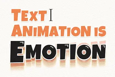
エモいテキストアニメーション4つをCSSとJavascriptで作ってみた【ソースコード付き】
印象深いWebサイトを作るコツは何だと思いますか?
それは「細部までこだわること」です。とくにタイポグラフ(テキスト)はこだわりどころで、作り込まれたサイトはアニメーションまでこだわっていることが多いです。
文章には筆者の思いが詰まっています。この思いを動きで表現するのが「テキストアニメーション」です。
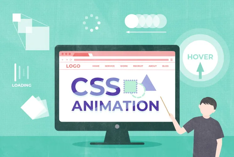
ここでは簡単にできるタイポグラフのアニメーションを、表現別に以下の4パターンご紹介します。
- ポップ・元気なイメージ
- ふんわり優しいイメージ
- クラシカル・静かなイメージ
- 強く強調する
ソースコード付きだから、HTMLと一緒にそのまま貼っていただければ同じものが作れます。ぜひ試してみてください。
ではいってみましょう。
ポップ・元気なイメージ
明 日 晴 れ た ら ど こ に 行 こ う
ポップなイメージには、元気よく跳ねているアニメーションが合います。このようなアニメーションは、幼稚園のサイトやかわいいイラストが使われたサイトで使われていることが多いです。イージングの数値を変えればまた違った印象にできそうですね。
【HTML】
<p class="text">
  <span>明</span>
  <span>日</span>
  <span>晴</span>
  <span>れ</span>
  <span>た</span>
  <span>ら</span>
  <span>ど</span>
  <span>こ</span>
  <span>に</span>
  <span>行</span>
  <span>こ</span>
  <span>う</span>
</p>
【CSS】
.text{
  height: 200px;
}
.text span{
  display: inline-block;
  position: relative;
}
.text span{
  animation: pop 0.6s ease-in 0.5s infinite;
}
.text span:nth-child(1) {
  animation-delay: 0s;
}
.text span:nth-child(2) {
  animation-delay: 0.1s;
}
.text span:nth-child(3) {
  animation-delay: 0.2s;
}
.text span:nth-child(4) {
  animation-delay: 0.3s;
}
.text span:nth-child(5) {
  animation-delay: 0.4s;
}
.text span:nth-child(6) {
  animation-delay: 0.5s;
}
.text span:nth-child(7) {
  animation-delay: 0.6s;
}
.text span:nth-child(8) {
  animation-delay: 0.7s;
}
.text span:nth-child(9) {
  animation-delay: 0.8s;
}
.text span:nth-child(10) {
  animation-delay: 0.9s;
}
.text span:nth-child(11) {
  animation-delay: 1s;
}
.text span:nth-child(12) {
  animation-delay: 1.1s;
}
.text span:nth-child(13) {
  animation-delay: 1.2s;
}
@keyframes pop {
  0%{
    top: 0;
    transform: scale(1);
  }
  30% {
    top: -25%;
  }
  50% {
    transform: scale(1);
  }
  90% {
    top: 0;
    transform: scale(1.2,0.8);
  }
  100% {
    top: 0;
    transform: scale(1);
  }
}
ふんわり優しいイメージ
雪が溶けると春になります
優しい印象にしたい場合は、ふんわり・もったりとしたアニメーションが合います。
ふんわりしたアニメーションはフェードイン・アウトが代表的ですが、今回はさらに少し工夫してみました。mix-blend-modeを使って文字に動画を乗せています。動画を使うことによってCSSでは描写できない表現も可能になります。
【HTML】
<div class="textArea">
<p class="text">雪が溶けると春になります</p>
<video class="js_inlineVideo" src="video/video.mp4" poster="img/poster.jpg" muted></video>
</div>
【CSS】
.textArea{
overflow: hidden;
position: relative;
background: #fff;
}
.textArea video{
display: inline-block;
width: 100%;
position: absolute;
left: 0;
top: -50%;
pointer-events: none;
background-color: white;
transform: scale(-1, -1);
mix-blend-mode: screen;
animation: opacity 0.2s both;
animation-delay: 5s;
}
.textArea .text{
filter: blur(10px);
opacity: 0;
animation: blur 5s both;
}
.is-act .text{
  animation: blur 5s both;
}
.is-act .textArea video{
  mix-blend-mode: screen;
  animation: opacity 0.2s both;
  animation-delay: 5s;
}
@keyframes blur {
0% {
  opacity: 0;
  filter: blur(10px);
}
100% {
  opacity: 1;
  filter: blur(0);
}
}
@keyframes opacity {
100% {
  opacity: 0;
}
}
【JavaScript】
$(window).on('load', function () {
  const videos = $('.js_inlineVideo');
  if (videos.length) {
    playVideos(videos);
    $(window).on('scroll', function () {
      playVideos(videos);
    });
  }
  function playVideos(videos) {
    const startPosition = $(window).scrollTop() + $(window).height();
    videos.each(function (index) {
      if (startPosition > $(this).offset().top - 200) {
        $(this).get(0).play();
      }
    });
  }
});
クラシカル・静かなイメージ
人には
届けたい想いがあるのです
「クラシカル・静かなイメージ」は「ふんわり優しいイメージ」と近いです。opacityやfilterの使い方を変えることで、また違ったテイストになります。1文字ずつ見せるようにしているので、小説のように読ませたい文章には効果的なアニメーションです。
※セリフはアニメ「ヴァイオレットエヴァーガーデン」より引用
【HTML】
<p class="text">
<span>人</span><span>に</span><span>は</span><br>
<strong>届けたい想い</strong><span>が</span><span>あ</span><span>る</span><span>の</span><span>で</span><span>す</span>
</p>
【CSS】
.text{
font-family: 'Noto Serif JP', serif;
letter-spacing: 2px;
}
.text span{
opacity: 0;
animation: letter-glow 0.7s 0s ease both;
}
.is-act .text span{
opacity: 1;
}
.text span:nth-child(1) {
animation-delay: 0.5s;
}
.text span:nth-child(2) {
animation-delay: 0.7s;
}
.text span:nth-child(3) {
animation-delay: 0.9s;
}
.text strong{
opacity: 0;
filter: blur(10px);
animation: letter-glow 0.7s 0s ease both, blur 2s 0s ease both;
font-size: 200%;
animation-delay: 1.5s;
}
.text span:nth-child(4) {
animation-delay: 2.1s;
}
.text span:nth-child(5) {
animation-delay: 2.3s;
}
.text span:nth-child(6) {
animation-delay: 2.5s;
}
.text span:nth-child(7) {
animation-delay: 2.7s;
}
.text span:nth-child(8) {
animation-delay: 2.9s;
}
.text span:nth-child(9) {
animation-delay: 3.1s;
}
.text span:nth-child(10) {
animation-delay: 3.3s;
}
.text span:nth-child(11) {
animation-delay: 3.5s;
}
.is-act .text span{
  opacity: 0;
  animation: letter-glow 0.7s 0s ease both;
}
.is-act .text span{
opacity: 1;
}
.is-act .text span:nth-child(1) {
  animation-delay: 0.5s;
}
.is-act .text span:nth-child(2) {
  animation-delay: 0.7s;
}
.is-act .text span:nth-child(3) {
  animation-delay: 0.9s;
}
.is-act .text strong{
  opacity: 0;
  filter: blur(10px);
  animation: letter-glow 0.7s 0s ease both, letter-blur 2s 0s ease both;
  font-size: 200%;
  animation-delay: 1.5s;
}
.is-act .text span:nth-child(4) {
  animation-delay: 2.1s;
}
.is-act .text span:nth-child(5) {
  animation-delay: 2.3s;
}
.is-act .text span:nth-child(6) {
  animation-delay: 2.5s;
}
.is-act .text span:nth-child(7) {
  animation-delay: 2.7s;
}
.is-act .text span:nth-child(8) {
  animation-delay: 2.9s;
}
.is-act .text span:nth-child(9) {
  animation-delay: 3.1s;
}
.is-act .text span:nth-child(10) {
  animation-delay: 3.3s;
}
.is-act .text span:nth-child(11) {
  animation-delay: 3.5s;
}
@keyframes letter-glow{
0%   {
  opacity: 0;
  text-shadow: 0px 0px 1px rgba(255,255,255,0.1);
}
66%  {
  opacity: 1;
  text-shadow: 0px 0px 20px rgba(255,255,255,0.9);
}
77%   { opacity: 1;  }
100% {
  opacity:0.7;
  text-shadow: 0px 0px 20px rgba(255,255,255,0.0);
}
}
@keyframes blur {
0% {
  opacity: 0;
  filter: blur(10px);
}
100% {
  opacity: 1;
  filter: blur(0);
}
}
強く強調する
大丈夫だよ。絶対に大丈夫。
すっごく強調したい文章があるときに、とてもインパクトがあるのでおすすめです。プロモーションサイト等で使えそうですね。
【HTML】
<p class="text"><span>大丈夫だよ</span><strong>絶対に大丈夫。</strong></p>
【CSS】
.text span{
  display: inline-block;
  opacity: 0;
  transform: translateX(-100px);
  transition: all .3s ease .65s;
}
.is-act .text span{
  opacity: 1;
  transform: translateX(0);
}
.text >strong{
  position: relative;
  display: inline-block;
  font-size: 6.3vw;
  transform: scale(0);
}
.is-act .text >strong{
  -webkit-text-stroke-color: transparent;
  -webkit-text-fill-color: #000;
  -webkit-text-stroke-width: 1px;
  animation: zoom 0.5s ease-in both;
  animation-delay: 1.5s;
}
.text >strong::before,
.text >strong::after {
  content: '絶対に大丈夫。';
  position: absolute;
  top: 0;
  left: 50%;
  margin-left: -50%;
  width: 100%;
  height: 150%;
  opacity: 0;
  will-change: transform, opacity;
}
.is-act .text >strong::before,
.is-act .text >strong::after{
  opacity: 0.5;
  color: #000;
}
.is-act .text >strong::before{
  animation: wave 0.5s ease-in 0.5s both;
  animation-delay: 1.5s;
}
.is-act .text >strong::after{
  animation: wave 0.5s ease-in 0.05s both;
  animation-delay: 1.8s;
}
@keyframes zoom {
  0% {
    transform: scale(1.5);
    opacity: 0;
  }
  100% {
    transform: scale(1);
    opacity: 1;
  }
}
@keyframes wave {
  0% {
    opacity: 0.5;
    transform: translateZ(0) scale(1);
  }
  to {
    opacity: 0;
    transform: translateZ(0) scale(1.3);
  }
}
まとめ
以上、4パターンのテキストアニメーションのご紹介でした。CSSとJavaScriptだけでとても簡単にリッチな表現ができます。単調になりがちなタイポグラフをアニメーションで華やかに表現してみてはいかがでしょうか。
動き別にCSSアニメーションを見たい方はこちらの記事もどうぞ。
【現役コーダー秘伝】簡単CSSアニメーションの種類や作り方

この記事を書いた人
クーシーブログ編集部
1999年に設立したweb制作会社。「ラクスル」「SUUMO」「スタディサプリ」など様々なサービスの立ち上げを支援。10,000ページ以上の大規模サイトの制作・運用や、年間約600件以上のプロジェクトに従事。クーシーブログ編集部では、数々のプロジェクトを成功に導いたメンバーが、Web制作・Webサービスに関するノウハウやハウツーを発信中。
お問い合わせはこちらから
Web制作デザイン、丸ごとお任せ
お問い合わせする
テキスト:仲村ゆりの デザイン:村上
Share on
COOSYの
制作実績
UIUXと美しさを両立させた、クーシーが誇る成功事例一覧。
課題解決のアイデア満載です。


