Share on
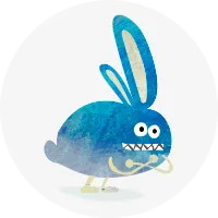
現役コーダーがCSSの限界に挑戦!自社のロゴをCSSだけで作ってみた

こんにちは。クーシーの佐野です。
今回はCSSと自分の限界に挑戦する企画ということで、CSSだけで以下のクーシーのロゴを作ってみました。
繰り返しますが、これはCSSです。画像ではありません!
どうやって作ったか、気になりませんか?
本記事では、これの作り方を解説します。
「どうやって作ったのかぜんぜん想像がつかない!」という方はぜひ最後までお読みください。
ではいってみましょう。
プロジェクト概要
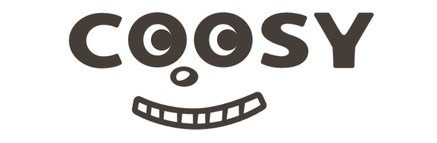
こちらの弊社ロゴに目玉を入れたものをHTMLとCSSのみで再現します。ただ形を作ってもつまらないので、目と鼻と口を動くようにしました。そのため、ロゴにはない「目玉」と閉眼時のみ現れる「瞼」を追加しています。
作り方は、ざっくり書くと以下のとおりです。
- HTMLで骨組みを作る。使用したのは「div」「span」およびその擬似要素「:before」「:after」のみ
- HTMLにCSSで肉付けする
- CSSにアニメーションをつける
「肉付け」について少し説明します。基本的な図形は角丸の四角と円です。いずれも基本になるのは四角。これは要素にbackground-colorを指定すればOK。さらにborderやborder-radiusを付与すれば、角丸の四角や円ができます。
そうして作成したパーツをtransform で変形し、position で並べればこんな複雑な図形ができるはず、と考えて作りました。
制作手順
制作手順は以下のとおりです。
- もとの画像を見る
- パーツを作る
- パーツを組み合わせる
- 目、口、鼻の動きを入れる
順番に見ていきましょう。
もとの画像を見る
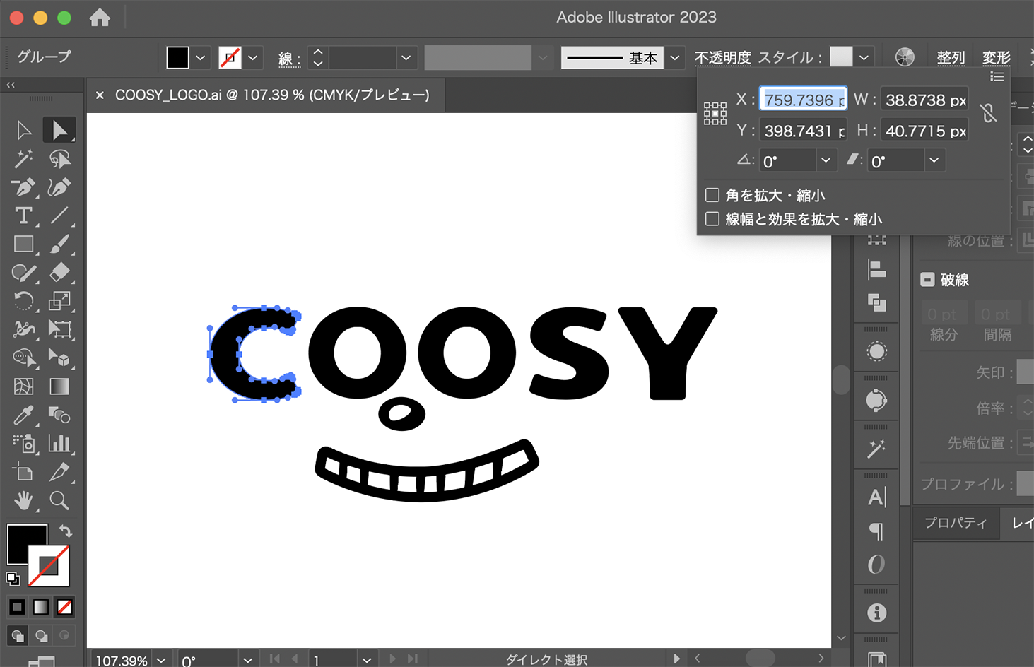
もとの画像はIllustratorで用意しました。画像からパーツのサイズを確かめつつ作成していきます。
パーツを作る
まずはHTMLで骨組みを作ります。大まかに「C」「OO」「S」「Y」「鼻」「口」の6パーツに分けました。以下のとおり、HTMLはどれもシンプルです。
<body>
  <div class="logo">
    <!-- C -->
    <div class="logo__C">
      <span class="logo__C__top"></span>
      <span class="logo__C__bottom"></span>
    </div>
    <!-- O(目・瞼を含む) -->
    <div class="logo__O">
      <div class="logo__O__eyelid anime--blink"></div>
    </div>
    <div class="logo__O">
      <div class="logo__O__eyelid anime--blink"></div>
    </div>
    <!-- S -->
    <div class="logo__S">
      <span class="logo__S__top"></span>
      <span class="logo__S__middle"></span>
      <span class="logo__S__bottom"></span>
    </div>
    <!-- Y -->
    <div class="logo__Y"></div>
    <!-- 鼻 -->
    <div class="logo__nose anime--nose"></div>
    <!-- 口 -->
    <div class="logo__mouth anime--mouse">
      <div class="logo__mouth__upper"></div>
      <span class="logo__mouth__tooth"></span>
      <span class="logo__mouth__tooth"></span>
      <span class="logo__mouth__tooth"></span>
      <span class="logo__mouth__tooth"></span>
      <span class="logo__mouth__tooth"></span>
      <span class="logo__mouth__tooth"></span>
      <span class="logo__mouth__tooth"></span>
      <div class="logo__mouth__lower"></div>
    </div>
  </div>
</body>
次にCSSで形を作っていきます。まずは「C」から。
ポイントはシンプルな形に分解することです。「C」の場合は、円弧 + 月型 + 長方形となります。
/* 月型 */
.logo__C {
  height: 39px;
  width: 24px;
  border-left: 13px solid #393a34;
  border-radius: 100%;
}
/* 長方形(角丸) */
.logo__C:before, .logo__C:after {
  content: "";
  display: inline-block;
  border-radius: 10px 0 0 10px;
  background-color: #393a34;
}
.logo__C:before {
  width: 3px;
  height: 9px;
}
.logo__C:after {
  width: 3px;
  height: 10px;
}
/* 曲線 */
.logo__C__top, .logo__C__bottom {
  border: solid 10px;
  border-color: transparent transparent #393a34 transparent;
}
.logo__C__top {
  width: 42px;
  height: 64px;
  border-radius: 0 0 50% 50%;
}
.logo__C__bottom {
  width: 42px;
  height: 74px;
  border-radius: 0 0 50% 50%;
}
続いて「O」。目と瞼になるパーツもこれで作ります。形としては「楕円」です。
/* 円(外側) */
.logo__O {
  background-color: #393a34;
  border-radius: 50%;
  height: 40px;
  width: 43px;
}
/* 円(内側) */
.logo__O::before {
  content: "";
  display: inline-block;
  background-color: #fff;
  border-radius: 50%;
  width: 20px;
  height: 22px;
}
/* 円(黒目) */
.logo__O::after {
  content: "";
  display: inline-block;
  background-color: #393a34;
  border-radius: 50%;
  width: 14px;
  height: 13px;
}
/* 円(まぶた) */
.logo__O__eyelid {
  height: 0px;
  width: 25px;
  border-bottom: 0 solid #393a34;
  border-radius: 100%;
}
「S」は長方形 と円弧の組み合わせで、CSSはやや多めです。
.logo__S {
  position: relative;
}
/* 月型 */
.logo__S__top {
  display: inline-block;
  height: 24px;
  width: 24px;
  border-left: 13px solid #393a34;
  border-radius: 100%;
}
/* 曲線 */
.logo__S__top:before {
  content: "";
  border: solid 9px;
  border-color: transparent transparent #393a34 transparent;
  width: 23px;
  height: 14px;
  border-radius: 0 0 50% 50%;
}
.logo__S__middle:before, .logo__S__middle:after {
  content: "";
  border: solid 8px;
  border-color: transparent transparent #393a34 transparent;
}
.logo__S__middle:before {
  width: 22px;
  height: 11px;
  border-radius: 0 0 50% 50%;
}
.logo__S__middle:after {
  width: 22px;
  height: 96px;
  border-radius: 0 0 50% 50%;
}
/* 月型 */
.logo__S__bottom {
  display: inline-block;
  height: 24px;
  width: 24px;
  border-right: 13px solid #393a34;
  border-radius: 100%;
}
/* 曲線 */
.logo__S__bottom:before {
  content: "";
  border: solid 9px;
  border-color: transparent transparent #393a34 transparent;
  width: 28px;
  height: 22px;
  border-radius: 0 0 50% 50%;
}
/* 長方形(角丸) */
.logo__S:before, .logo__S:after {
  content: "";
  display: inline-block;
  border-radius: 10px 0 0 10px;
  background-color: #393a34;
}
.logo__S:before {
  width: 3px;
  height: 9px;
}
.logo__S:after {
  width: 3px;
  height: 9px;
}
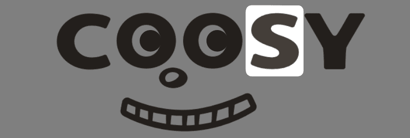
「Y」は長方形と平行四辺形で作られます。
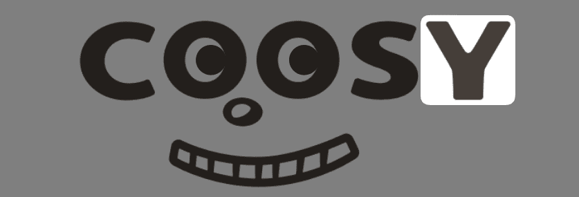
/* 長方形(角丸) */
.logo__Y {
  background-color: #393a34;
  border-radius: 0 0 2px 2px;
  height: 18.5px;
  width: 16px;
}
.logo__Y::before, .logo__Y::after {
  content: "";
  display: inline-block;
  background-color: #393a34;
  border-radius: 1.5px 2px 0 0;
  width: 12.5px;
  height: 27px;
}
「鼻」は楕円と歪み円でできています。
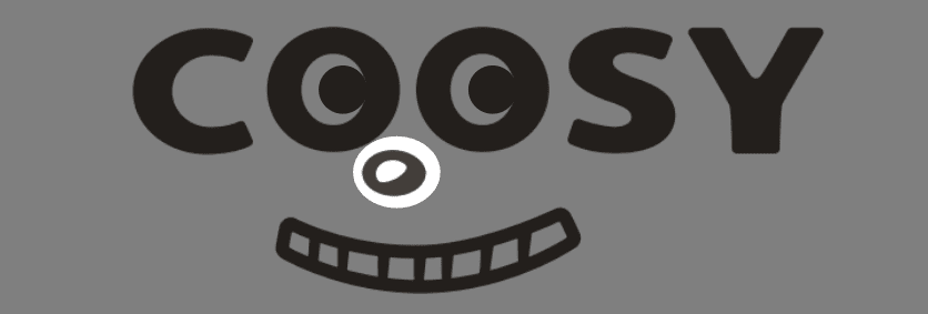
/* 楕円 */
.logo__nose {
  background-color: #393a34;
  border-radius: 50%;
  height: 14px;
  width: 20px;
}
/* 歪み円 */
.logo__nose::after {
  content: "";
  display: inline-block;
  background-color: #fff;
  border-radius: 54% 45% 77% 22%/62% 32% 68% 38%;
  width: 10px;
  height: 7px;
}
「口」は形が複雑なわりに、CSS少なめです。円弧と長方形と台形でできています。
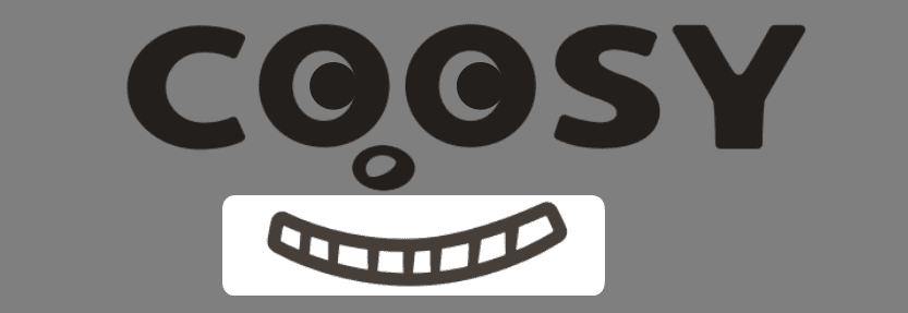
/* 口端_長方形(角丸) */
.logo__mouth::before, .logo__mouth::after {
  content: "";
  display: inline-block;
  border-radius: 10px 0 0 10px;
  background-color: #393a34;
}
.logo__mouth::before {
  width: 5px;
  height: 13px;
}
.logo__mouth::after {
  width: 4.4px;
  height: 14.45px;
}
/* 上顎・下顎(曲線) */
.logo__mouth__upper, .logo__mouth__lower {
  border: solid 5px;
  border-color: transparent transparent #393a34 transparent;
}
.logo__mouth__upper {
  width: 103px;
  height: 40px;
  border-radius: 0 0 50% 50%;
}
.logo__mouth__lower {
  width: 114px;
  height: 62px;
  border-radius: 0 0 50% 50%;
}
/* 歯(台形) */
.logo__mouth__tooth {
  display: inline-block;
  width: 4px;
  height: 10px;
  background: #393a34;
  clip-path: polygon(0 0, 100% 0, 85% 100%, 15% 100%);
}
以上で、各パーツができました。次はこれらを組み立てます。
パーツを組み合わせる
図形を横並びにしたいのでdisplay: flex;を使用。position: relative;とし、各パーツの位置を調整します。
.logo {
  display: flex;
  align-items: flex-end;
  position: relative;
}
まずは「C」から。
/* 月型 */
.logo__C {
  height: 39px;
  width: 24px;
  border-left: 13px solid #393a34;
  border-radius: 100%;
  position: relative;
}
/* 長方形(角丸) */
.logo__C:before, .logo__C:after {
  content: "";
  display: inline-block;
  border-radius: 10px 0 0 10px;
  background-color: #393a34;
  position: absolute;
}
.logo__C:before {
  width: 3px;
  height: 9px;
  top: 2px;
  left: 22px;
  transform: rotate(200deg); // 回転
}
.logo__C:after {
  width: 3px;
  height: 10px;
  top: 28px;
  left: 21px;
  transform: rotate(162deg); // 回転
}
/* 曲線 */
.logo__C__top, .logo__C__bottom {
  border: solid 10px;
  border-color: transparent transparent #393a34 transparent;
  position: absolute;
}
.logo__C__top {
  width: 42px;
  height: 64px;
  border-radius: 0 0 50% 50%;
  top: -3px;
  left: -12px;
  transform: rotate(-204deg); // 回転
}
.logo__C__bottom {
  width: 42px;
  height: 74px;
  border-radius: 0 0 50% 50%;
  bottom: -5px;
  left: -8px;
  transform: rotate(29deg); // 回転
}
「O」の部分です。「O」は構成要素が4種類あります。
COOSYの「O」は「円(外側)」と「円(内側)」を組み合わせます。あとは「O」の中の黒目とまばたきの時に使う瞼です。瞼は閉じる時だけ見えればいいので、初期値ではheight: 0px; border-bottom: 0px;となっています。
/* 円(外側) */
.logo__O {
  background-color: #393a34;
  border-radius: 50%;
  height: 40px;
  width: 43px;
  position: relative;
  left: 10px;
}
.logo__O:nth-of-type(2) {
  left: 6px;
}
/* 円(内側) */
.logo__O::before {
  content: "";
  display: inline-block;
  background-color: #fff;
  border-radius: 50%;
  width: 20px;
  height: 22px;
  position: absolute;
  top: 50%;
  left: 50%;
  transform: translateY(-50%) translateX(-50%);
}
/* 円(黒目) */
.logo__O::after {
  content: "";
  display: inline-block;
  background-color: #393a34;
  border-radius: 50%;
  width: 14px;
  height: 13px;
  position: absolute;
  top: 50%;
  left: 50%;
  transform: translateY(-50%) translateX(-25%);
}
/* 円(まぶた) */
.logo__O__eyelid {
  height: 0px;
  width: 25px;
  border-bottom: 0 solid #393a34;
  border-radius: 100%;
  position: absolute;
  top: 4px;
  left: 9px;
}
「S」を組み立てます。月型、曲線、長方形(角丸)を以下のCSSで配置しました。
.logo__S {
  position: relative;
  left: 17px;
}
/* 月型 */
.logo__S__top {
  display: inline-block;
  height: 24px;
  width: 24px;
  border-left: 13px solid #393a34;
  border-radius: 100%;
  position: absolute;
  top: -40px;
}
/* 曲線 */
.logo__S__top:before {
  content: "";
  border: solid 9px;
  border-color: transparent transparent #393a34 transparent;
  width: 23px;
  height: 14px;
  border-radius: 0 0 50% 50%;
  transform: rotate(174deg);
  position: absolute;
  top: -1px;
  left: -15px;
}
.logo__S__middle:before, .logo__S__middle:after {
  content: "";
  border: solid 8px;
  border-color: transparent transparent #393a34 transparent;
  position: absolute;
}
.logo__S__middle:before {
  width: 22px;
  height: 11px;
  border-radius: 0 0 50% 50%;
  top: -43px;
  left: 0px;
  transform: rotate(30deg); // 回転
}
.logo__S__middle:after {
  width: 22px;
  height: 96px;
  border-radius: 0 0 50% 50%;
  top: -67px;
  left: -47px;
  transform: rotate(-90deg);// 回転
}
/* 月型 */
.logo__S__bottom {
  display: inline-block;
  height: 24px;
  width: 24px;
  border-right: 13px solid #393a34;
  border-radius: 100%;
  position: absolute;
  top: -24px;
  left: -3px;
}
/* 曲線 */
.logo__S__bottom:before {
  content: "";
  border: solid 9px;
  border-color: transparent transparent #393a34 transparent;
  width: 28px;
  height: 22px;
  border-radius: 0 0 50% 50%;
  position: absolute;
  bottom: -1px;
  left: -6px;
  transform: rotate(-9deg);// 回転
}
/* 長方形(角丸) */
.logo__S:before, .logo__S:after {
  content: "";
  display: inline-block;
  border-radius: 10px 0 0 10px;
  background-color: #393a34;
  position: absolute;
}
.logo__S:before {
  width: 3px;
  height: 9px;
  top: -38px;
  left: 29px;
  transform: rotate(209deg);// 回転
}
.logo__S:after {
  width: 3px;
  height: 9px;
  top: -11px;
  left: 0;
  transform: rotate(25deg);// 回転
}
「Y」です。長方形(角丸)を組み合わせます。
/* 長方形(角丸) */
.logo__Y {
  background-color: #393a34;
  border-radius: 0 0 2px 2px;
  height: 18.5px;
  width: 16px;
  position: relative;
  left: 68px;
}
.logo__Y::before, .logo__Y::after {
  content: "";
  display: inline-block;
  background-color: #393a34;
  border-radius: 1.5px 2px 0 0;
  width: 12.5px;
  height: 27px;
  position: absolute;
  top: -21px;
}
.logo__Y::before {
  transform: skew(30deg, 0);// 傾斜
  left: -6px;
}
.logo__Y::after {
  transform: skew(-30deg, 0);// 傾斜
  right: -6px;
}
「鼻」は楕円と歪み円を重ねて配置します。
/* 楕円 */
.logo__nose {
  background-color: #393a34;
  border-radius: 50%;
  height: 14px;
  width: 20px;
  position: relative;
  top: 13px;
  right: 66px;
}
/* 歪み円 */
.logo__nose::after {
  content: "";
  display: inline-block;
  background-color: #fff;
  border-radius: 54% 45% 77% 22%/62% 32% 68% 38%;
  width: 10px;
  height: 7px;
  position: absolute;
  top: 3px;
  left: 4px;
}
「口」です。口端_長方形(角丸)、上顎・下顎(曲線) 、歯(台形)を組み合わせます。
.logo__mouth {
  position: absolute;
  bottom: -30px;
}
/* 口端_長方形(角丸) */
.logo__mouth::before, .logo__mouth::after {
  content: "";
  display: inline-block;
  border-radius: 10px 0 0 10px;
  background-color: #393a34;
  position: absolute;
}
.logo__mouth::before {
  width: 5px;
  height: 13px;
  top: -10px;
  left: 45px;
  transform: rotate(8deg);
}
.logo__mouth::after {
  width: 4.4px;
  height: 14.45px;
  top: -15.9px;
  left: 137.5px;
  transform: rotate(148deg);
}
/* 上顎・下顎(曲線) */
.logo__mouth__upper, .logo__mouth__lower {
  border: solid 5px;
  border-color: transparent transparent #393a34 transparent;
  position: absolute;
}
.logo__mouth__upper {
  width: 103px;
  height: 40px;
  border-radius: 0 0 50% 50%;
  bottom: -2px;
  left: 36px;
  transform: rotate(-3deg);
}
.logo__mouth__lower {
  width: 114px;
  height: 62px;
  border-radius: 0 0 50% 50%;
  bottom: -14px;
  left: 32px;
  transform: rotate(-3deg);
}
/* 歯(台形) */
.logo__mouth__tooth {
  display: inline-block;
  width: 4px;
  height: 10px;
  background: #393a34;
  clip-path: polygon(0 0, 100% 0, 85% 100%, 15% 100%);
  position: absolute;
}
.logo__mouth__tooth:nth-of-type(1) {
  left: 56px;
  top: -5px;
}
.logo__mouth__tooth:nth-of-type(2) {
  left: 65px;
  top: -1px;
}
.logo__mouth__tooth:nth-of-type(3) {
  left: 78px;
  top: 0;
}
.logo__mouth__tooth:nth-of-type(4) {
  left: 90px;
  top: 0;
}
.logo__mouth__tooth:nth-of-type(5) {
  left: 99px;
  top: 0;
}
.logo__mouth__tooth:nth-of-type(6) {
  left: 111px;
  top: -2px;
}
.logo__mouth__tooth:nth-of-type(7) {
  left: 123px;
  top: -5px;
}
これで形は完成です。
目、口、鼻の動きを入れる
目、口、鼻につけるアニメーションはCSSのkeyframesを使用します。つけた動きは以下の3種類です。
- 目 … ぱちぱちとした瞬き
- 口 … 上下にゆらゆらする動き
- 鼻 … 上下にひくひくする動き
それぞれ見ていきましょう。
目をぱちぱちさせる動きは、7秒間に3回起こるように設定しました。瞼が閉じる時だけ、border-bottomが28pxになります。
.anime--blink {
  animation-name: blinkAnime;//アニメーションの定義名
  animation-duration: 7s;//アニメーション1回分の長さ
  animation-iteration-count: infinite;//再生回数。infiniteは無限繰り返し。
  animation-timing-function: linear;//アニメーションの進行具合。linerは一定。
}
/* アニメーションの動きを指定 */
@keyframes blinkAnime {
  0% {border-bottom: 0 solid #393a34;}//瞼を開ける
  2% {border-bottom: 28px solid #393a34;}//瞼を閉じる
  4% {border-bottom: 0 solid #393a34;}//瞼を開ける
  70% {border-bottom: 0 solid #393a34;}//瞼を開ける
  72% {border-bottom: 28px solid #393a34;}//瞼を閉じる
  74% {border-bottom: 0 solid #393a34;}//瞼を開ける
  76% {border-bottom: 0 solid #393a34;}//瞼を開ける
  78% {border-bottom: 28px solid #393a34;}//瞼を閉じる
  80% {border-bottom: 0 solid #393a34;}//瞼を開ける
  100% {border-bottom: 0 solid #393a34;}//瞼を開ける
}
口が上下にゆらゆらする動きは1回分を3秒間とし、2pxだけ上下するようにしました。
.anime--mouse {
  animation-name: mouseAnime;//アニメーションの定義名
  animation-duration: 0.5s;//アニメーション1回分の長さ
  animation-iteration-count: infinite;//再生回数。infiniteは無限繰り返し。
  animation-timing-function: linear;//アニメーションの進行具合。linerは一定。
}
/* アニメーションの動きを指定 */
@keyframes mouseAnime {
  0% {transform: translateY(0px);}
  50% {transform: translateY(-1px);}//口を上げる
  100% {transform: translateY(0px);}//口を下げる
}
鼻が上下にひくひくする動きは、1回分を3秒間とし、2pxだけ上下するようにしました。
.anime--nose {
  animation-name: noseAnime;//アニメーションの定義名
  animation-duration: 3s;//アニメーション1回分の長さ
  animation-iteration-count: infinite;//再生回数。infiniteは無限繰り返し。
  animation-timing-function: linear;//アニメーションの進行具合。linerは一定。
}
/* アニメーションの動きを指定 */
@keyframes noseAnime {
  0% {transform: translateY(0px);}
  20% {transform: translateY(0px);}
  22% {transform: translateY(2px);}//鼻を下げる
  24% {transform: translateY(0px);}//元の位置に戻す
  26% {transform: translateY(2px);}//鼻を下げる
  28% {transform: translateY(0px);}//元の位置に戻す
  100% {transform: translateY(0px);}
}
こうしてできあがったのが、こちらの動くロゴです。
まとめ
以上、「クーシーのロゴをCSSで作ってみた」でした。「画像を作った方が楽だし早いよ!」と企画に対して元も子もないことを思いつつも、CSSでの作図方法を覚えておけばコーディングにおける表現の幅が広がるのは間違いありません。
実際、画像ではなくCSSでできた方が便利なことも多くあります。一見無駄にがんばって身に付けた知識も、いずれ実作業で役に立つ日が来るかもしれません。いや、来ると信じたい。
そんな日が来るかどうかはさておき、この記事を読んだあなたに楽しんでいただけましたら幸いです。
この記事を書いた人
クーシーブログ編集部
1999年に設立したweb制作会社。「ラクスル」「SUUMO」「スタディサプリ」など様々なサービスの立ち上げを支援。10,000ページ以上の大規模サイトの制作・運用や、年間約600件以上のプロジェクトに従事。クーシーブログ編集部では、数々のプロジェクトを成功に導いたメンバーが、Web制作・Webサービスに関するノウハウやハウツーを発信中。
お問い合わせはこちらから
Web制作デザイン、丸ごとお任せ
お問い合わせする
テキスト:佐野由和 デザイン:小林沙綾
Share on
COOSYの
制作実績
UIUXと美しさを両立させた、クーシーが誇る成功事例一覧。
課題解決のアイデア満載です。

